The ggswim package eases the development of swimmer plots in R through extension of ggplot2. In this vignette, we’ll walk through how users can create visually striking swimmer plots.
ggswim offers several layering functions that mimic other “geom” functions from ggplot2:
The former, an extension of geom_segment(), allows users
to construct the horizontal bars, what we’ll sometimes refer to as
“lanes.” Meanwhile, geom_swim_marker() wraps
geom_text() to effortlessly embed key events of interest,
or “markers,” onto the lanes. These can take the form of shapes,
symbols, or even emojis.
Drawing from the well-established principles of ggplot2, ggswim
allows users to apply familiar layer-building techniques, including the
application of styles and themes. You’ll also see that common behaviors
are still accessible with ggswim such as auto-completing
aes() parameters with piping.
Adding a Lane Layer
Let’s get started building our swimmer plot! As with the README, we
will be using ggswim’s internal datasets: patient_data,
infusion_events, and end_study_events.
Let’s start with observing patient_data’s structure:
#> # A tibble: 75 × 4
#>    pt_id disease_assessment       start_time end_time
#>    <chr> <chr>                         <dbl>    <dbl>
#>  1 01    CR/CRi + B Cell Recovery       -2.8      0
#>  2 01    RD                              0        0.9
#>  3 01    CR/CRi + B Cell Aplasia         0.9      0
#>  4 01    CR/CRi + B Cell Aplasia         0        1.8
#>  5 01    CR/CRi + B Cell Recovery        1.8      2
#>  6 02    RD                             -2.8      0
#>  7 02    CRi                             0        0.2
#>  8 03    CR/CRi + B Cell Recovery       -2.4      0
#>  9 03    CR/CRi + B Cell Recovery        0        0.9
#> 10 03    CR/CRi + B Cell Aplasia         0.9      2.8
#> # ℹ 65 more rows
patient_data contains a long dataset where patient ID’s
(pt_id) can be repeated. These rows are differentiated by
disease_assessmentss combined with corresponding start and
end times, representing months. Together, these rows detail clinical
trial timelines for a given patient.
-
disease_assessmentis broken down into a few categories where:- CR = “Complete Response”
- CRi = “Complete Response with Incomplete Blood Count Recovery”
- RD = “Relapsed Disease”
Now, let’s make the plot using ggplot() and our first
layer with geom_swim_lane():
library(ggplot2)

p <- ggplot() +
  geom_swim_lane(
    data = patient_data,
    mapping = aes(
      x = start_time,
      xend = end_time,
      y = pt_id,
      color = disease_assessment
    ),
    linewidth = 3
  )

p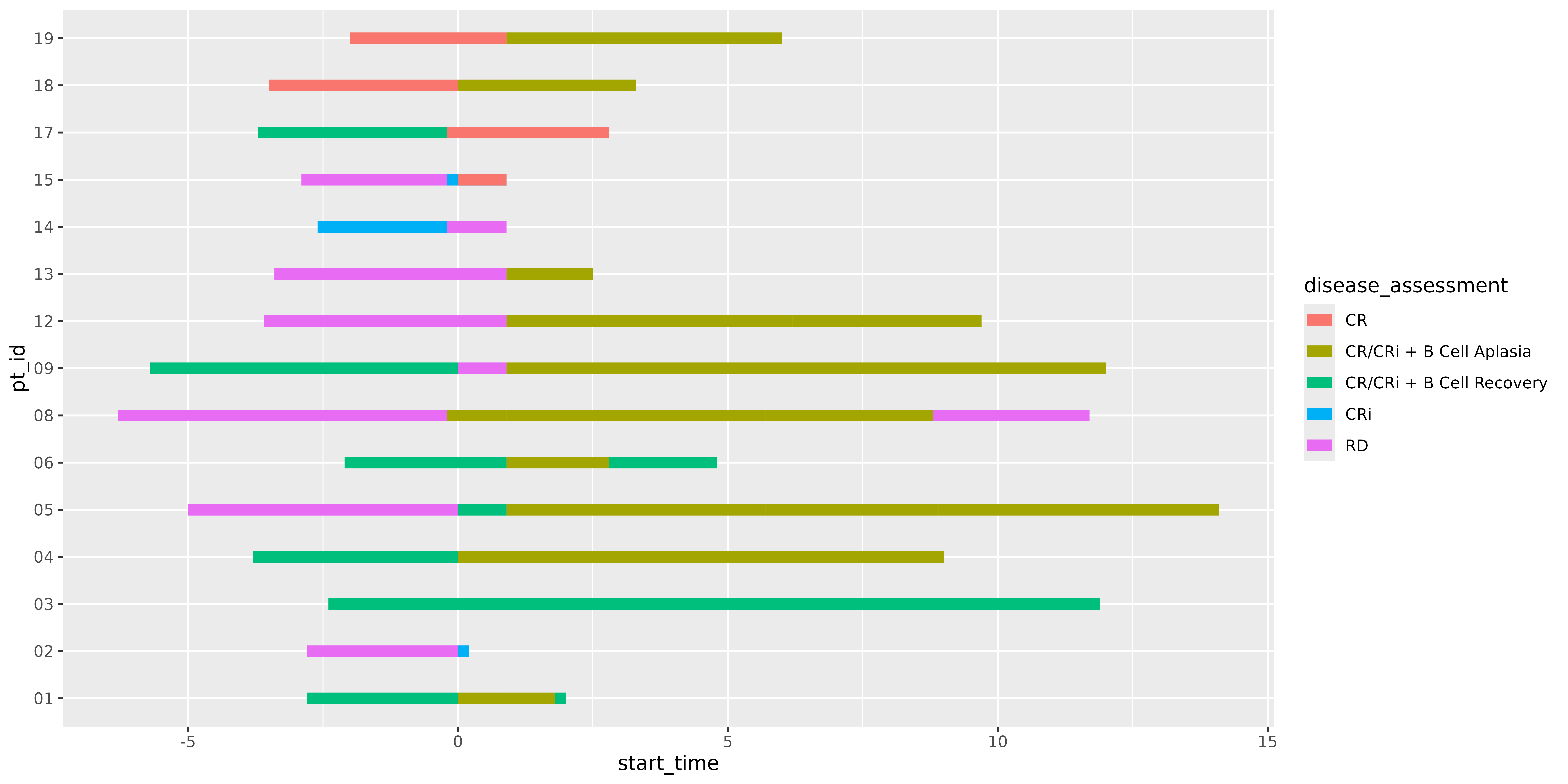
Here we have a simple bar graph showing infusions grouped by patients
with a given disease assessment status. geom_swim_lane()
does the work of setting up geom_segment() and readying our
plot layers for additional ggswim-specific features such as the
“markers” mentioned earlier. It’s worth noting that
geom_swim_lane() is a very thin wrapper around
geom_segment() and supports the same functionality apart
from a yend since swimmer plots tend to be horizontal.
Adding a Marker Layer: Points
Now, let’s add a marker layer by first inspecting the
infusion_events and end_study_events
datasets:
infusion_events
#> # A tibble: 18 × 5
#>    pt_id time_from_initial_infusion label             glyph colour
#>    <chr>                      <dbl> <chr>             <chr> <chr>
#>  1 01                           1   First Reinfusion  ⬤     #999999
#>  2 02                           0   First Reinfusion  ⬤     #999999
#>  3 03                           2   First Reinfusion  ⬤     #999999
#>  4 03                           3   Second Reinfusion ⬤     #f57dc1
#>  5 04                           5   First Reinfusion  ⬤     #999999
#>  6 05                           2   First Reinfusion  ⬤     #999999
#>  7 05                           4.3 Second Reinfusion ⬤     #f57dc1
#>  8 06                           2   First Reinfusion  ⬤     #999999
#>  9 08                           1   First Reinfusion  ⬤     #999999
#> 10 08                           2.5 Second Reinfusion ⬤     #f57dc1
#> 11 09                           7   First Reinfusion  ⬤     #999999
#> 12 12                           6   First Reinfusion  ⬤     #999999
#> 13 13                           1   First Reinfusion  ⬤     #999999
#> 14 14                           0   First Reinfusion  ⬤     #999999
#> 15 15                           0   First Reinfusion  ⬤     #999999
#> 16 17                           1   First Reinfusion  ⬤     #999999
#> 17 18                           3   First Reinfusion  ⬤     #999999
#> 18 19                           4   First Reinfusion  ⬤     #999999
This dataset is much simpler, indicating the time from the initial
infusion (0), and reinfusions at some point beyond 0 (if a patient had
any). These are also categorized under label.
glyph and colour will serve as helpful
specifiers when we add our markers onto our swimmer plot. Initial
infusions aren’t a part of this dataset since the plot itself is
centered around them, and having markers for all segments at month 0
would be relatively meaningless.
Next, let’s look at our end of study events, i.e. events that indicate a patient has left the study for various reasons.
end_study_events
#> # A tibble: 7 × 4
#>   pt_id time_from_initial_infusion label                     glyph
#>   <chr>                      <dbl> <chr>                     <chr>
#> 1 01                           2   Other End Study Reason    ⚠️
#> 2 02                           0.2 Deceased                  ❌
#> 3 03                          11.9 Completed Study Follow-Up ✅
#> 4 05                          14.1 Completed Study Follow-Up ✅
#> 5 06                           4.8 Other End Study Reason    ⚠️
#> 6 08                          11.7 Other End Study Reason    ⚠️
#> 7 12                           9.7 Other End Study Reason    ⚠️
You’ll notice that this dataset includes use of emojis under
glyph. In addition to shapes and symbols, ggswim supports
the use of emojis when rendering swimmer plots. If issues arise in rendering, you may need to check
your options settings and ensure a proper graphics device like
“AGG”.
While it’s common to encounter these as separate datasets in the
wild, it will make our lives much easier to combine
end_study_events and infusion_events together
since they share roughly the same data structure and the markers exist
on the same timeline.
all_events <- dplyr::bind_rows(
  infusion_events,
  end_study_events
)

all_events
#> # A tibble: 25 × 5
#>    pt_id time_from_initial_infusion label             glyph colour
#>    <chr>                      <dbl> <chr>             <chr> <chr>
#>  1 01                           1   First Reinfusion  ⬤     #999999
#>  2 02                           0   First Reinfusion  ⬤     #999999
#>  3 03                           2   First Reinfusion  ⬤     #999999
#>  4 03                           3   Second Reinfusion ⬤     #f57dc1
#>  5 04                           5   First Reinfusion  ⬤     #999999
#>  6 05                           2   First Reinfusion  ⬤     #999999
#>  7 05                           4.3 Second Reinfusion ⬤     #f57dc1
#>  8 06                           2   First Reinfusion  ⬤     #999999
#>  9 08                           1   First Reinfusion  ⬤     #999999
#> 10 08                           2.5 Second Reinfusion ⬤     #f57dc1
#> # ℹ 15 more rows
Let’s now call geom_swim_marker() and add the events
onto our plot. To do this, we will use geom_swim_marker()’s
custom marker aes() parameter:
p <- p +
  geom_swim_marker(
    data = all_events,
    aes(
      x = time_from_initial_infusion,
      y = pt_id,
      marker = label
    ),
    size = 4
  )

p
We’ve successfully made a swimmer plot with lanes and two different
kinds of marker layers! Notice how even though both the lanes and
markers use the color scale, they are separated in the legend output.
Let’s take it one step further and make use of the glyph
and colour columns we specified.
A Sense of Scale
Scales are a unique component of the ggplot2 framework. For more information on them and understanding how they work, you are encouraged to read the “Scales” chapter from ggplot2: Elegant Graphics for Data Analysis. In short, scales are responsible for connecting data with aesthetics and communicating those connections through elements like the plot legend.
scale_marker_discrete() makes it easy to specify and
take finer control over your markers and their appearance in the legend.
Typically, it can be difficult to have emojis and labels appear in the
place of legend glyphs. Let’s take a look at a typical output using base
ggplot2 with geom_text():
ggplot() +
  geom_text(
    data = all_events,
    aes(x = time_from_initial_infusion, y = pt_id, label = label, colour = glyph),
    size = 4
  )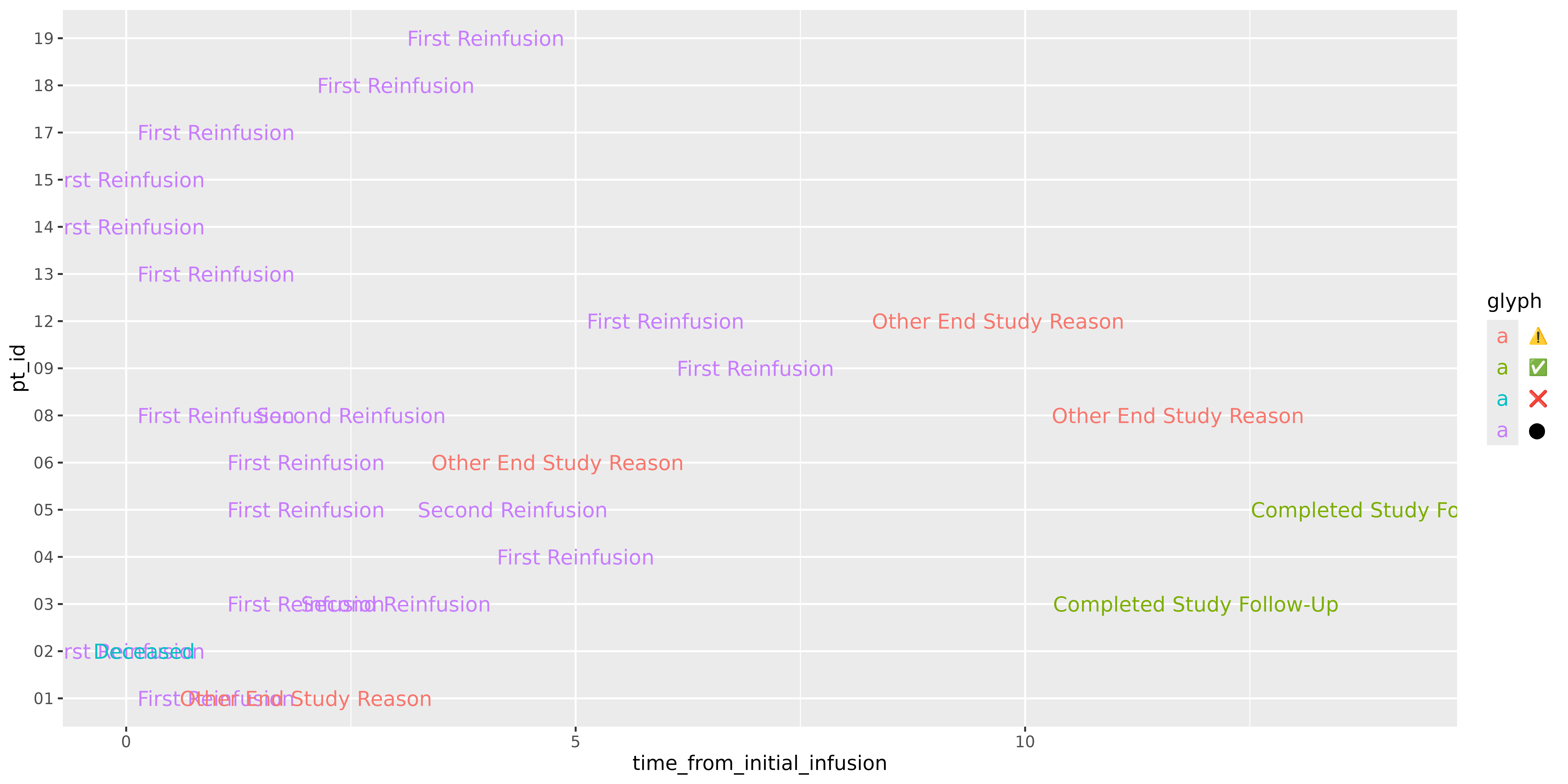
geom_text() does a decent job, and is actually what
geom_swim_marker() wraps. However, at it’s base level it
doesn’t quite set up the use of glyphs the way we would like to see them
in the legend display. Additionally, those glyphs don’t appear in the
plot. You could try to rework this with geom_point() or
geom_label(), but would still run into issues with scale
assignment. This pain point is one of the foundational reasons we made
ggswim in the first place!
Thanks to ggswim we can specify what belongs in the glyph versus text
elements of our legend. Additionally, we are able to use the “colour”
scales under the marker definition so ggswim can use the
same colour scale under the hood, but keep the identity of “markers” and
“lanes” separate in the output:
p <- p +
  scale_marker_discrete(
    name = "Study Events",
    glyphs = all_events$glyph,
    colours = all_events$colour,
    limits = all_events$label
  )

p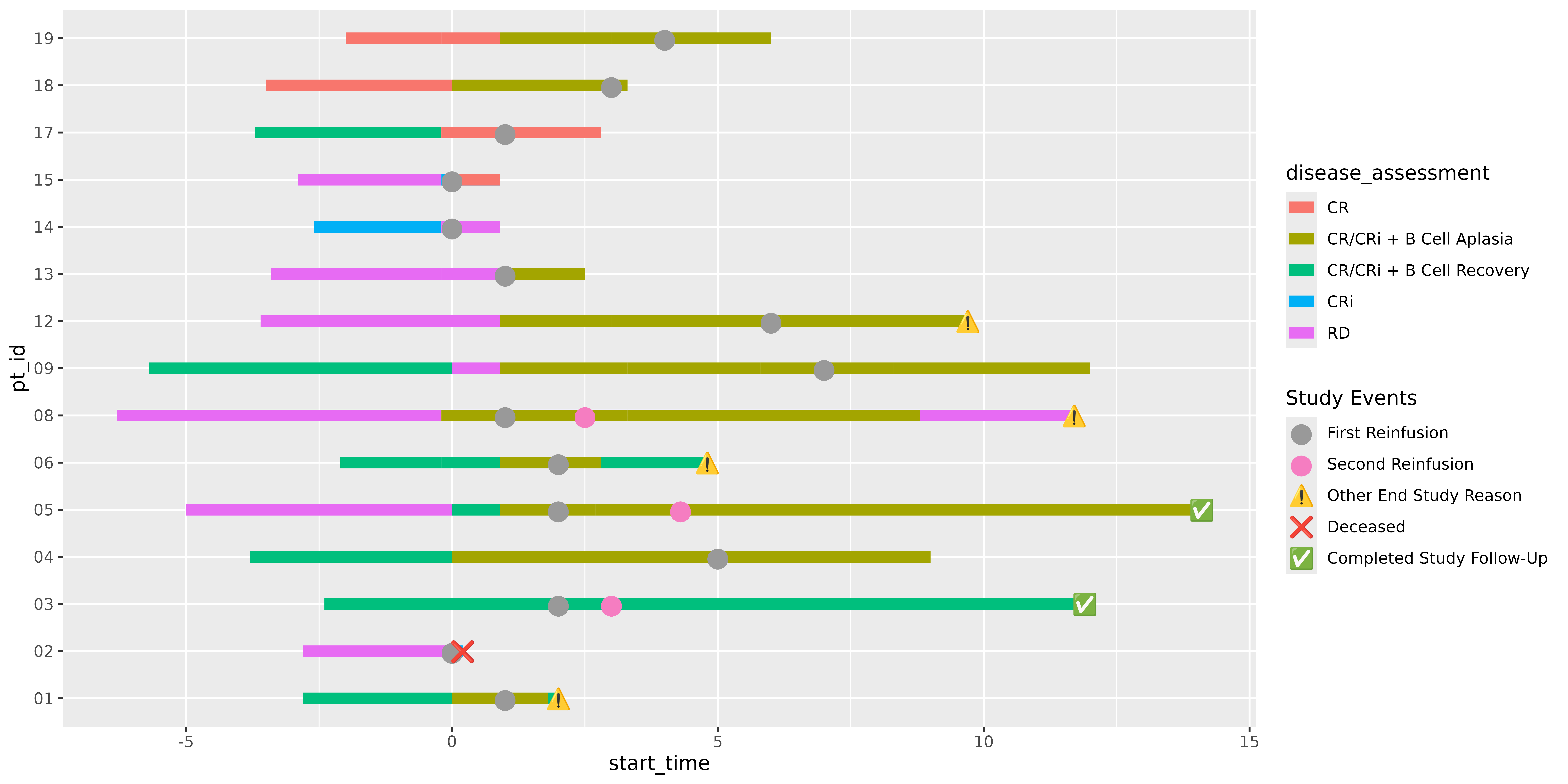
A Full Swimmer Plot
As mentioned in the README, all of the same ggplot2 techniques you would apply to your usual plots apply here. Below, we update the lanes to match a nicer palette with a new name and add on some plot labels:
library(ggplot2)

p <- p +
  theme_minimal() +
  scale_color_brewer(
    name = "Disease Assessments",
    palette = "Set1"
  ) +
  labs(title = "My Swimmer Plot") +
  xlab("Time (Months)") + ylab("Patient ID")

p
We can also apply the theme_ggswim() function to give it
some additional beautification:
p +
  theme_ggswim()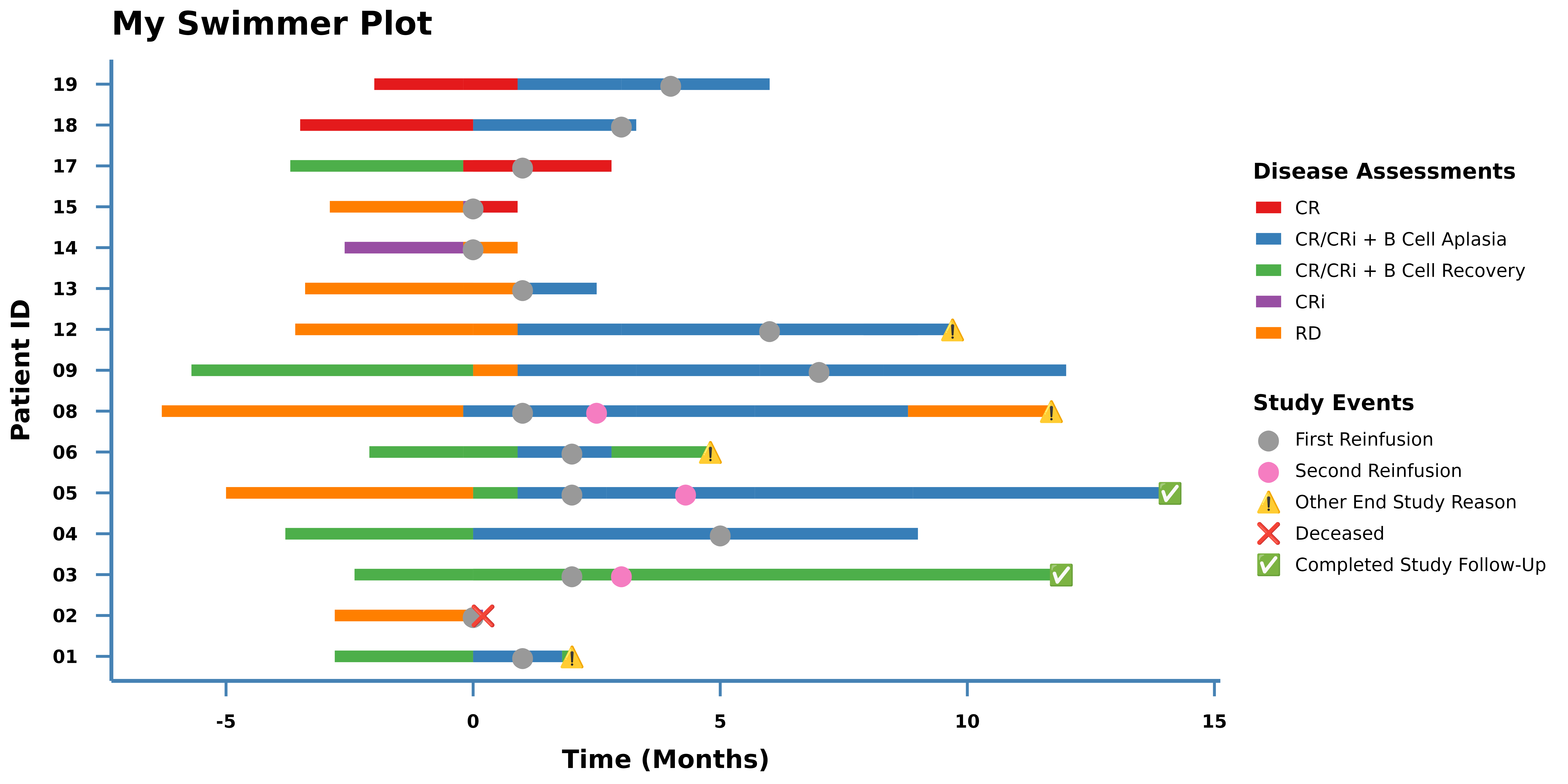
Additional notes
Some additional considerations to keep in mind when working with ggswim:
- Rendering Emojis and Custom Shapes: To ensure emojis and other custom shapes display correctly, users may need to switch their graphics rendering device to AGG.
- ggswim supports use of FontAwesome and Bootstrap icons for glyph definition in addition to shapes and emojis. Check out the Gallery for examples on how to add them to your plots!
